As we all know, businesses that make an excellent first impression are going to pull in more customers. This impression is usually the one that sticks. It’s tough to recover from a bad first impression. A great creative design company will use colors, themes, and proper spacing to develop a landing page that makes the best first impression possible.
There are other ways that good web design will help increase your sales. Here are a few examples:
- Solid web design makes business stand out. Consumers gravitate towards professional, sleek designs.
- It establishes the foundation for building lasting customer relationships due to the first impressions made.
- Well-designed websites are more comfortable to navigate, so the customer journey becomes easy.
- A sense of brand consistency will be a massive benefit from outstanding web design. Look at Google as an example. Whenever you see that color pattern, you automatically think of their brand.
- Good design unlocks the true potential of social media. Businesses that take the extra step of designing a fantastic website are likely going to focus on their social media design too.
Moving forth with the 6 factors which distinguish good web design and bad web designs-
1. Distractions
As we all remember the times when every website had flashy images, animations, and crazy color palettes. Now, we consider them a thing of the past, but these distracting effects can bother us from time to time.
These elements make users run away from a website immediately:
- Background music;
- Overused Flash;
- Too bright colors;
- Distracting gifs;
- Annoying animations.
These elements make users stay a bit for a while:
- The colors and photos broadcast the company’s style and are targeted at dog lover;
- There’s enough white space, the text is easy to read and is distributed logically;
- The sections are well-divided by design elements and pictures.
2. Animations
If you don’t feel the need to use animations on your website, it’s better to completely avoid it.
Below, you’ll see a website with the background full of animations. It looks at first glance, that the background is more important than the site’s content – it grabs all of your attention.
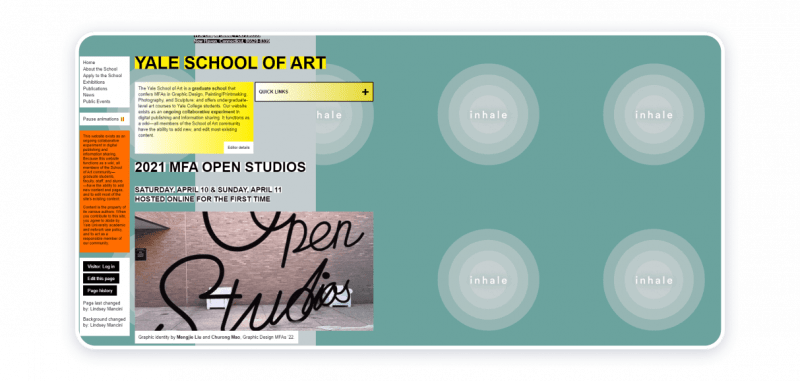
If you choose to use animation, make sure there is one bolding element on the page. You can apply animations to explain who you are in a detailed manner.

3. Typography and Text
Bad typography kills the potent content. These typography design mistakes create a bad impression of a website:
- Too big or too small font sizes;
- Never-ending paragraphs;
- Non-matching typefaces;
- Silly fonts like Comic Sans.
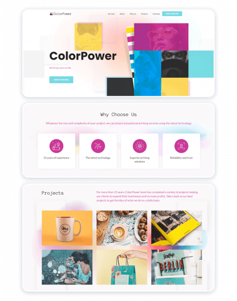
This printing services website template also consists of a big amount of pictures and text. But here’s how it’s different from the bad example:
- White space allows you to read without stressing out your eyes;
- Big chunks of text are divided into small paragraphs which makes them easy to understand;
- The “About” section is divided into several blocks of text, so it’s easier to read the page till the very end;
- The advantages listed in the “Why Us” section are presented with icons in separate blocks;
- The services are described with a couple of lines and the “Learn More” link below. It allows avoiding long descriptions under every image.
4. Images and Illustrations
Images matter, as they can create a long-lasting impression, demonstrate products from a better angle and motivate consumers to build relationships with a brand.
Design mistakes related to images:
- Fake stock images;
- Low-resolution photos;
- Pictures not fitting the website parameters;
- Images not related to the text.
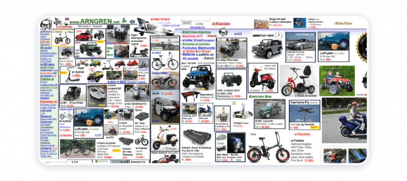
A bunch of low-quality images makes this website a wrong place to find something specific.
5. Consistency
Inconsistency is what makes a bad website. Below are some of the points one must go through to differentiate:
- All colors match each other and are taken from your brand book;
- All elements deliver a consistent message;
- You can form an opinion about the company by looking at the main page only.
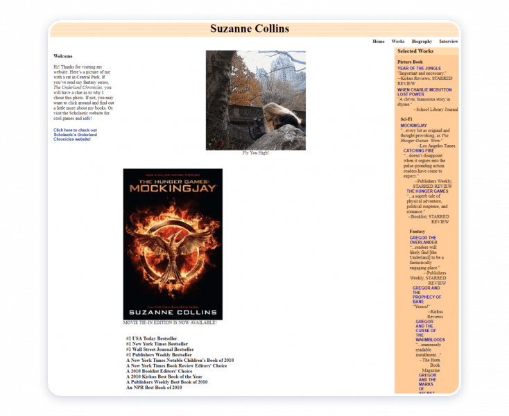
Surprisingly, the “Hunger Games” book author had a very inconsistent website with elements scattered all over the place.
On the lawyer’s personal website template, there are no photos representing the expert’s work. We added a couple of portrait photos to add personality to the service. The results include:
- Every sentence leads to the main idea and explains what services they offer;
- Several calls-to-actions in different areas lead to the same action: request a free consultation.
6. Website Usability
To achieve a well-designed interface created with a user in mind, consider these points:
- Information hierarchy;
- Mobile-friendly design;
- Clear navigation and structure;
- Easy-to-read copywriting.
Now with binding up my conversation, I would like to add up more about the sole essence about the topic.
All the good web design we see nowadays, are all made from the same motive to render the information more precisely and accurately. We can’t distinguish whether our web design is bad or good, only the users who surf through it know where to put it.
Thus for very bad web design there also once existed a good one with the same traits, what changed is nothing but the updation of information and trend. Hence, no design can be considered as bad or good from the creator’s side and can only be found good if it goes with the needs of the users.